WELCOME TO MY PORTFOLIO
Hello, I'm Grace Campbell, a first year new media design major at RIT. I have lived in Rochester all my life and am lucky to be next to such a great school. Currently, I am pursuing a minor in psychology and will later do a minor in mobile development as well. Outside of class, I am a part of new media club as well as jam club, which revolves around playing guitar. For now, this website is a work in progress, but as get into the weeds of my program, definitely expect more :)
IMAGINE RIT
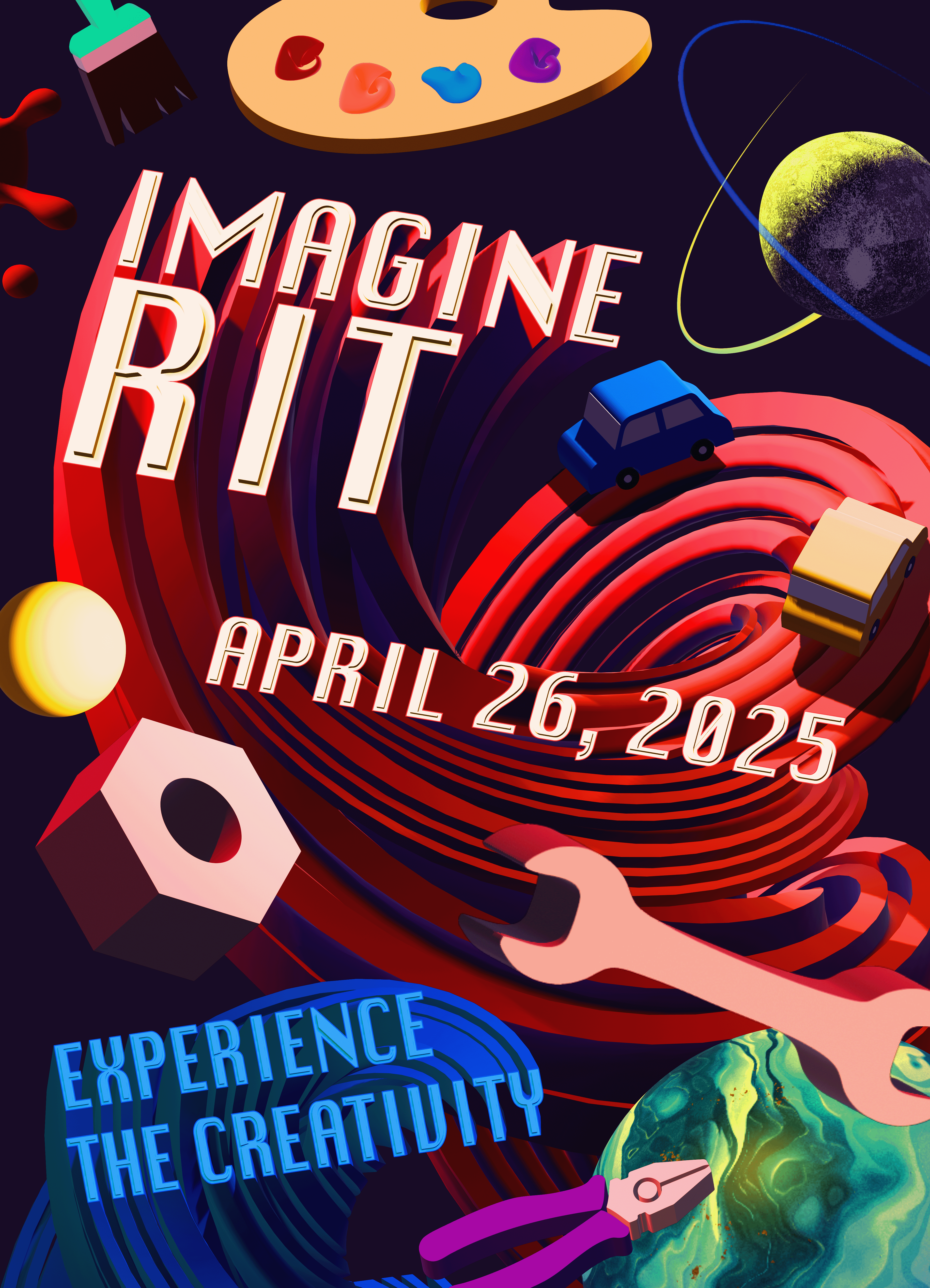
This is my entry for the poster design contest for Imagine RIT 2025. Imagine RIT is a festival taking place at RIT that exhibits projects done by RIT students, such as websites, art pieces, engineering projects and research. The target audience is families in the Rochester area, alumni and fellow students. The piece takes inspiration from outer space, which is often associated with innovation. My creative process began with me experimenting with the extrude tool in Adobe Illustrator and grew from there, as I began to see what kind of objects I could create with it. Overall, this poster took around 9 hours to complete over the span of 2 days.


DIGITAL SURVEY I FINAL PROJECT
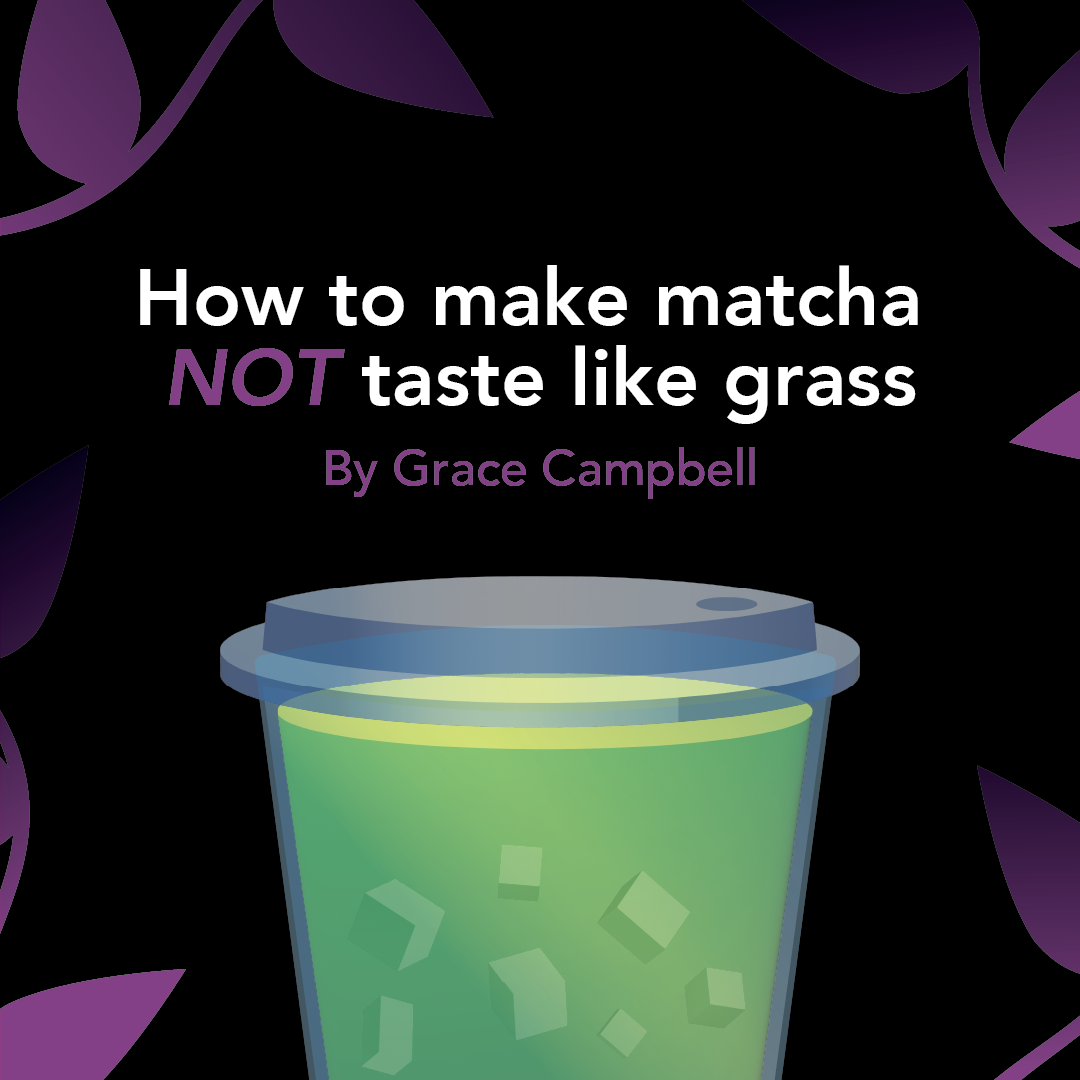
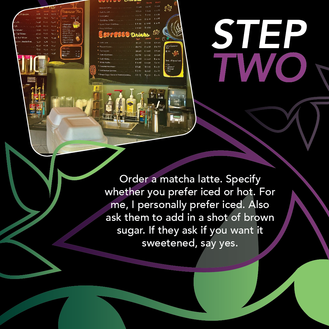
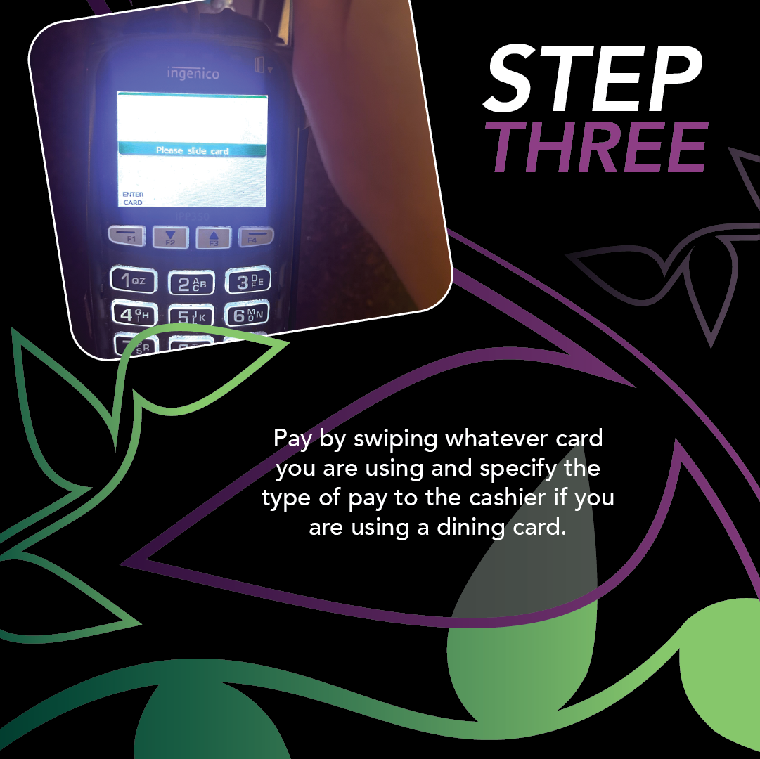
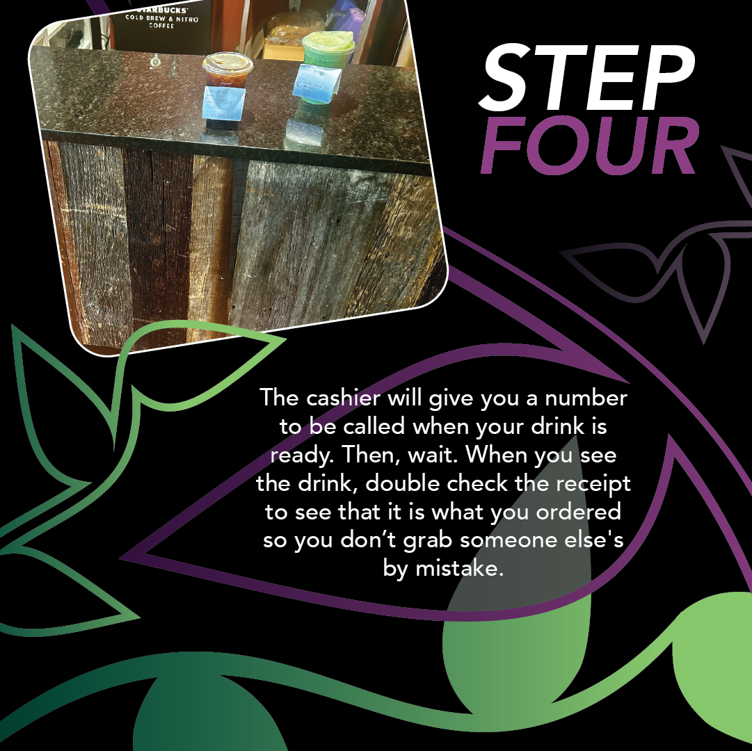
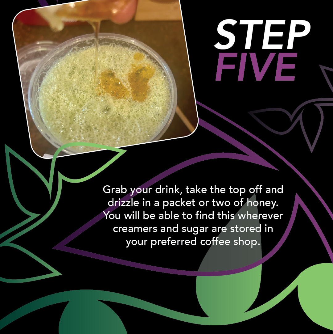
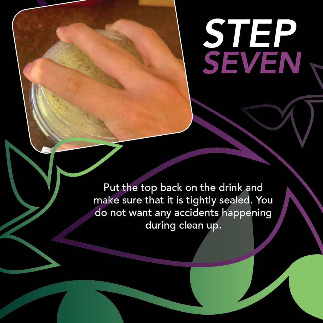
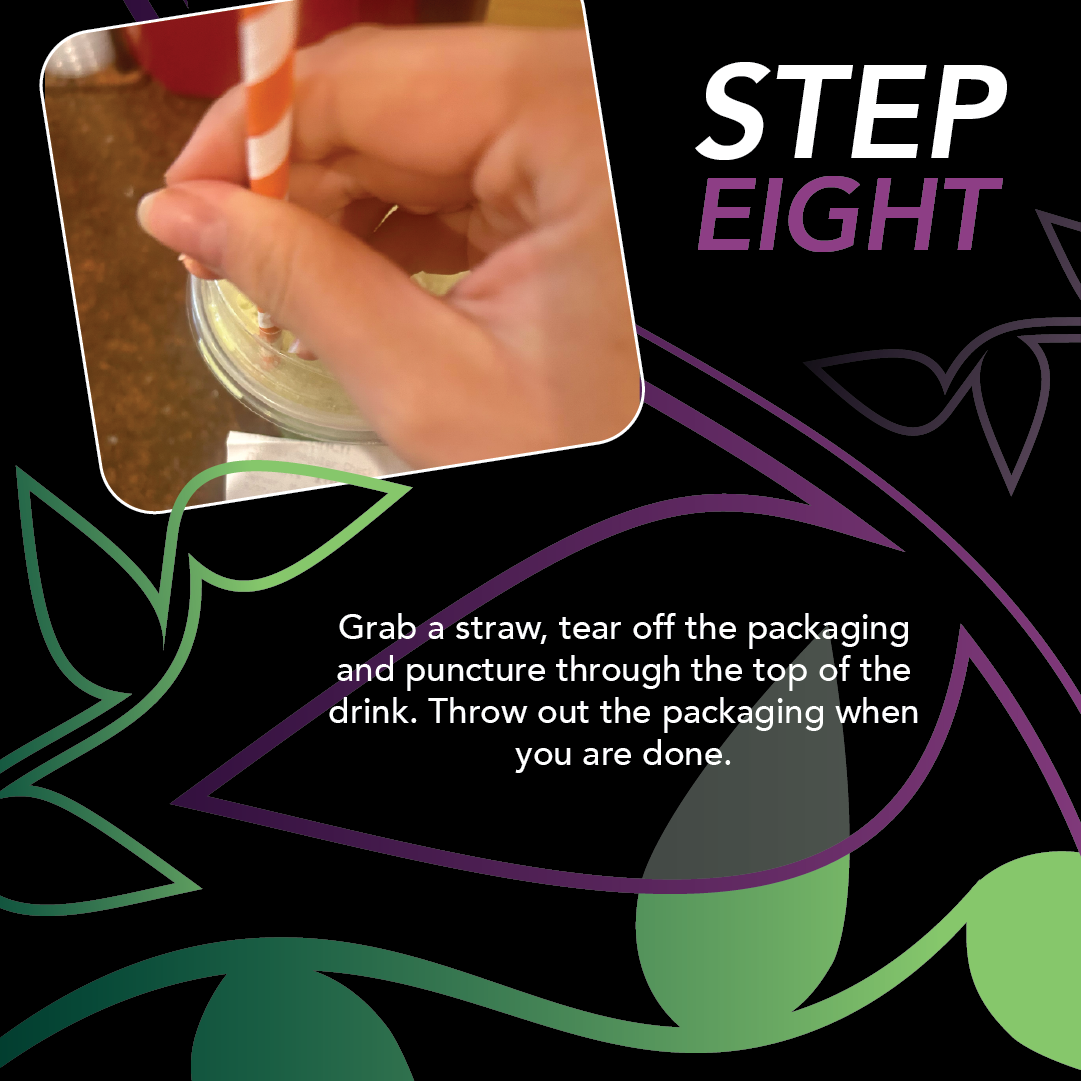
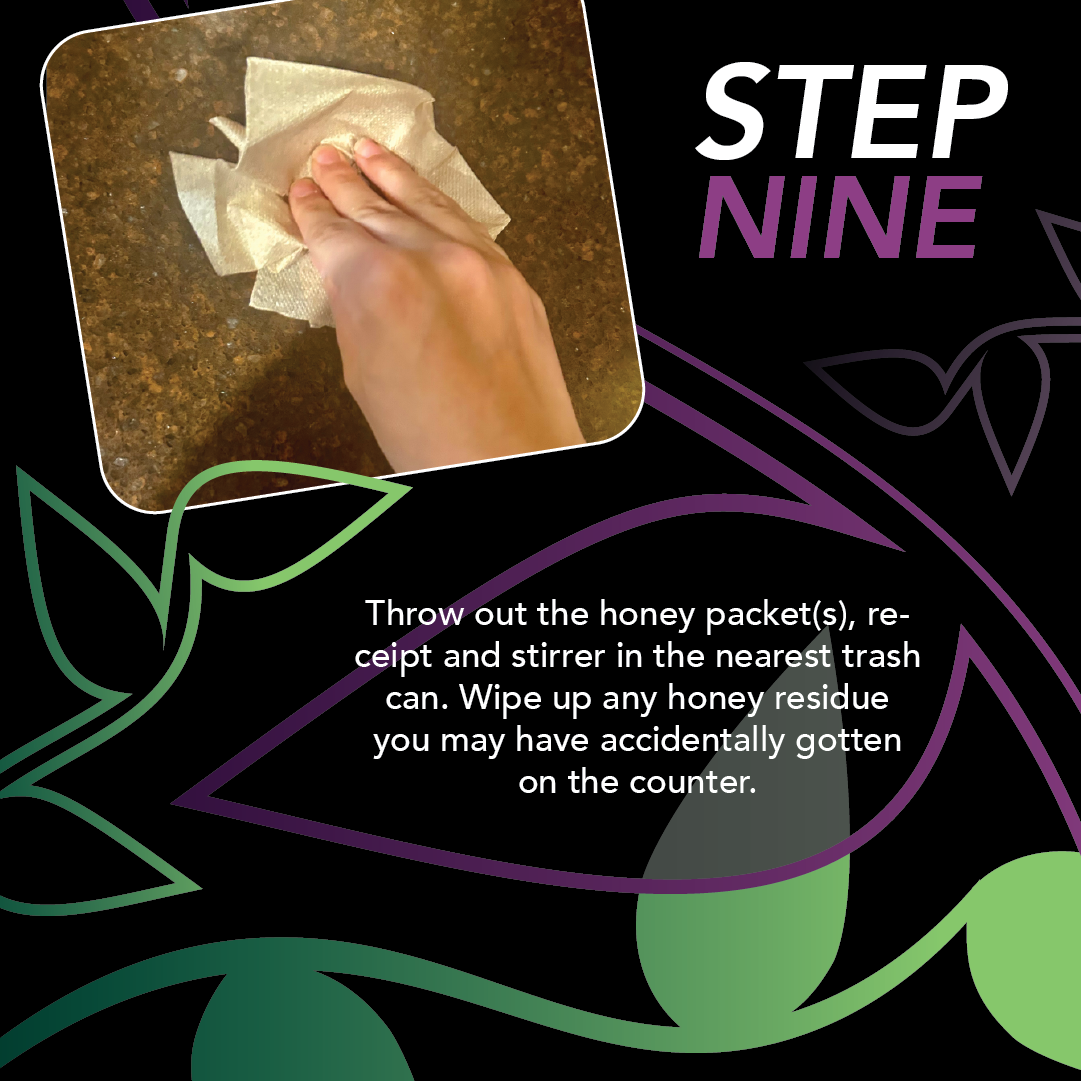
Our final project for new media design digital survey I was to create a how-to of a simple task we could illustrate in 9-12 steps. I chose to create a tutorial on how to order matcha and make it taste good. Striking a balance between illustrative and readable was very hard and took multiple tries to get right. After creating the first page I settled on a green and purple color scheme. Naturally, green is the color of matcha and purple is a bubbly yet soothing complimentary color to go with it. Then, I arranged the background leaves and added text and images according to their flow, being cautious about spacing so the layout doesn't look too imbalanced. I decided to make each page the same format. That way, the tutorial is eye-catching but still easy for the viewer to follow.


Letterhead
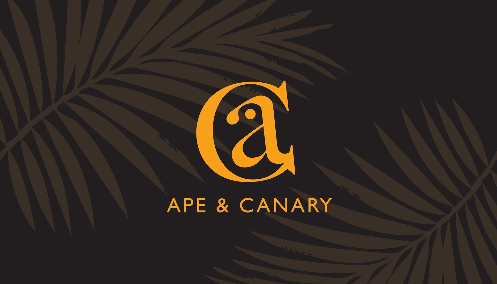
APE AND CANARY REBRAND
For an assignment in Digital Survey II, we had to create a hypothetical rebrand for a local business. I chose Ape and Canary, a spa. Ultimately, I went with a simple approach of placing the "A" inside the "C" and creating a bird. I went with a yellow color scheme and palm trees to create a warm, spa-like feeling while retaining the original charm of the actual branding.
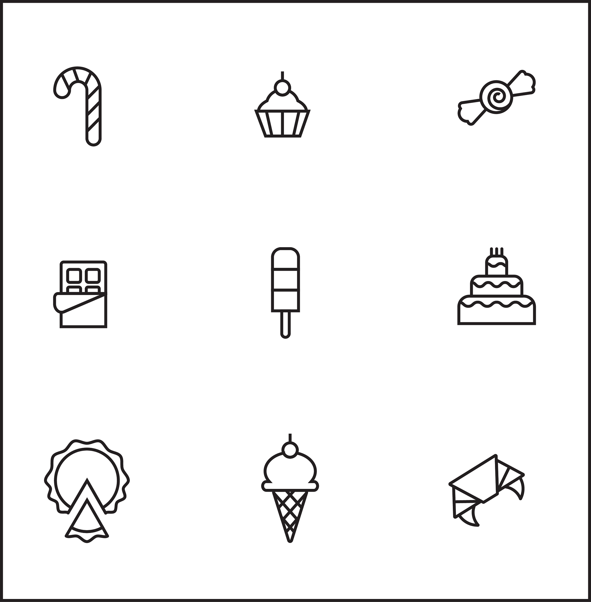
Dessert icons
For this assignment, we had to nine icons based on shapes, three being circles, three being squares and three being triangles. The icons had to also have an overarching theme, I chose desserts for its versatility, while still being fun and unique. This project really tested my ability with shapes and line cleanliness and took around 5 hours in total to complete. So although each icon looks simple, there was a lot of geometry that went on behind the scenes to make them look as clean as possible. The hardest to do right was probably the croissant.
MORE PROJECTS TO COME!